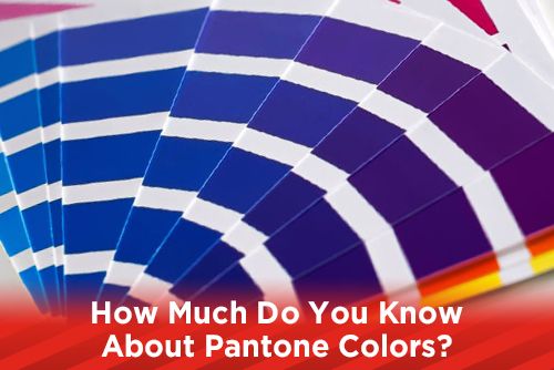
Earlier this week, we looked at the difference between CMYK and RGB and the range of colors each could achieve. In print and design, if you want to achieve a specific dark blue color and have it retain that hue as it goes through print and different presses, you can select a PMS color.
What is a PMS Color?
PMS stands for Pantone Matching System and is a color standardization that is used in print. Pantone began as a printing company but found more profit in creating the Pantone Matching System. The color gamut of CMYK is relatively small, so Pantone created 1,114 spot colors, some of which cannot be recreated in CMYK, by using 13 base pigments that are mixed together in a specific amount.
Why should I use a Pantone Color?
One reason to use Pantone colors is in creating a logo. Logos for business cards and envelopes are usually printed in two or more colors. You would choose a PMS color to achieve a specific color instead of printing the letterhead and business card in four colors. Also, if there is a certain color you are looking for, you can combine CMYK and PMS colors. The PMS colors would be an extra plate for each color you choose.
How do I use a Pantone Color?
Pantone colors are printed in a book, called a Pantone Chart, or Pantone color book, that lists all of the Pantone colors. There are also books for metallic and pastel colors; these have to be printed as a spot color as there is no way to recreate metallic and pastels colors in CMYK.
Pantone also creates a Pantone Chart with pantone swatches that have perforated squares, allowing you to tear out and attach to your proof. This gives the printing company a target for color while running your print job.
When selecting your PMS color, find one that matches the color you are looking for. A deep, dark blue would be in the 295 range, and a light yellow color would be PMS 106. Now when you send your logo to the printers, they will know to apply PMS 295 for the blue areas and PMS 106 for the yellow and your colors will be consistent from printer to printer.
Using spot colors is easier and cheaper if you need to change the color because the one you picked doesn’t match the look you are going for. Instead of replacing four plates (CMYK) you only need to clean the press and put a different PMS color in.
Why do some PMS colors look washed out when printed in CMYK?
By using 13 base pigments (14 with black), the color gamut range is significantly higher in the Pantone system than only using four inks (CMYK). Because of that, some PMS colors can not be simulated. Pantone provides a CMYK breakdown for each PMS color, but the colors out of the gamut range of CMYK will be look more dull and washed out than their PMS counterparts.
What is the Pantone Color of the Year?
In 2000, Pantone began selecting a “color of the year.” The Pantone Color Institute declares the color of the year after a secret meeting, and two days of debates. This year, the color chosen was Pantone 18-3838 Ultra Violet. This particular color can not be reproduced in CMYK and has no CMYK value conversion. But, Pantone 2096 is a close match to the color of the year and can be converted to CMYK.
How do I convert a PMS color to CMYK for print?
Pantone creates books of their color called Pantone charts that show the amount of pigments to mix to achieve a PMS color. They also produce a Pantone chart that shows you the PMS color on one side, and its CMYK equivalent on the other. This chart show you the color variances that occur when trying to achieve the spot color in CMYK. You can also use the Pantone color finder page on their website. If you know the CMYK build of a color and want to find a PMS color close to that build, use this website.
Using Pantone colors with Adobe Illustrator.
Adobe ships with the Pantone colors already installed. To find the PMS color you are looking for, in Illustrator, choose window > swatch libraries > color books > then the Pantone library you are looking for. Coated means it will print on coated paper, and uncoated means uncoated paper.
Pantone colors can help your design achieve that pop, but educate yourself on how to use them. If you use a spot PMS color that can be simulated in CMYK, then you’d be wasting money on an extra plate. You can also achieve some nice effects by combining metallic PMS colors and process colors. Get in contact with your service provider and speak with them about ways to properly use Pantone colors in your designs.
Stay up to date by subscribing to our mailing list.

