
Adobe Illustrator has been around since 1995 (1997 was when it first shipped). Since that time, there have been significant updates to the program. The latest version, Adobe Illustrator CC, includes support for touch screens and other updates for the graphic and web design community.
What is the main purpose of Adobe Illustrator?
Illustrator is widely used to produce vector format files, but Illustrator can also produce raster images using blends and the mesh tool. With the addition of multiple artboards, Illustrator can be used for page layout, but it is best to leave page layout to Adobe InDesign.
For print media, Illustrator is used to create logos and other vector files that are saved as eps or ai files and placed into InDesign as part of a flyer or business stationery. These eps or ai files are used as support files and should be included when you package your files to upload to your service provider or copy to a jump drive.
Which is better, Photoshop or Illustrator?
These two programs do not compete, but compliment each other. Photoshop is used mainly for raster images, images that are built out of pixels like photos. Illustrator creates vector images that are interpreted by the computer as lines or vectors and can be set as spot colors.
Adobe Photoshop can not create vector files, although you can create paths in Photoshop and copy and paste those into Illustrator. You can also copy a vector image from Illustrator and paste into Photoshop. When you do that, you have an option to paste as pixels, which will degrade the image as you enlarge it, or to paste as a smart object, allowing you to reduce and enlarge without causing pixelation.
Why shouldn't my logo be a raster (jpg) image?
In today’s world of online graphics and images, you may find it easy to just create your logo in Photoshop. This is not the way to create a logo. First off, a logo should look good in black and white, not grayscale, and be reproducible at any size. Creating a fancy logo with gradients and different opacities looks great on screen, but will not reproduce well in print.
To create a logo that works well in both print and web, it should begin in Adobe Illustrator as a vector file. A good logo should look good in black and white so that when it is reproduced on a pen or an etching it still retains its graphic design. Create the logo in Illustrator and if you need to make a jpg or png of the file, you can copy and paste into Photoshop.
Many companies do not want to pay the high expense for a four color business card or envelope, so a logo needs to be created in three or less spot colors. Illustrator is best for this because you can select colors from the Pantone color chart. Vector logos also have more clarity when printed than raster images.
I created my logo in two colors in Photoshop, but when it prints there are thin lines between the colors, why?
When a job is printed, the software that rips the artwork to make plates looks at the build of colors and creates traps between the colors. A trap is a color that slightly overprints another color in case there is movement on the press. If a logo or image is created in Photoshop, the ripping software only sees the images as a CT (continuous tone) and may not create a trap for the colors. When you create a logo in Photoshop, then there will be no trap and could result in lines between the colors.
If you create your logo or graphics in Illustrator, the ripping software will see each vector as linework and will create the traps needed. This will give your logo or graphics a nicer, crisper look than in Photoshop and avoid the issue of not trapping.
I only have a jpg image file, how can I vectorize it?
Sometimes, the only file a client has is an RGB jpg and you have to convert it to a vector file. If you are lucky, the image will be in black and white, large and a high resolution, 300 dpi or more. Then you could use Illustrators tracing feature and convert it to vector.
But in the real world, this hardly ever happens. Instead, you will receive a small, 72 dpi image. To get the image to vector format you will have to hand trace the image using the pen tool. Using the pen tool, you can click points to create shapes. If you need a curve, click and drag to see the handles that will allow you to adjust the Bezier curves. To achieve a smoother curve, use less points and more curves.
If your shape or logo you are recreating uses many shapes, create each shape separately then use the pathfinder tools to subtract and add to the shape. Once you have all the shapes created, then you can colorize and stroke them to achieve the look you want.
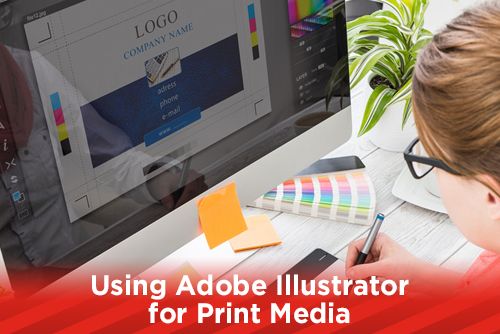
Illustrator has many tools and features that make it a perfect application for print media. Along with Photoshop, InDesign and a knowledgeable prepress department, graphic designers can achieve some award winning pieces in print. When you are using Illustrator for your logos and graphics, and come across something you can not figure out, give us a call. We’ve come across many areas that we have helped clients figure out.
Stay up to date by subscribing to our mailing list.