
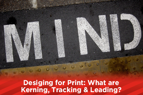
A great design can be ruined by bad kerning, leading and/or tracking. Knowing where to adjust your text will help you avoid these pitfalls and allow you to create great looking print pieces. If you do not know the difference between the terms, read along to help you better understand.
What is Kerning?
Kerning refers to two different aspects of type. One, it is the space between two letters, and two, it is the action to adjust the spacing between two letters. Sometimes the spacing between two characters in a typeset can visibly have too much or too little spacing in front or behind one character. This can make the types appear to have a typed space between the two characters. Many times this spacing is visible between the A and V characters, or any character with an outward angle or horizontal bar.
Many modern type styles have Metric Kerning or Optical Kerning built in to the font set. Metric Kerning (also known as Auto Kerning), has assigned tables that the typestyle will use to adjust the text when problem characters are entered already built into the font, and will most likely work best. If Auto/Metric produces unwanted results, you can highlight the problem areas, or your entire text, and choose Optical Kerning. Optical Kerning applies an algorithm that will adjust your characters to visibly look pleasing. Of course if you do not like the results of Metric or Optical Kerning, you can always adjust it using Manual Kerning.
What is Tracking?
Tracking can be confused for kerning, but instead of the space between two characters, tracking adjusts every character uniformly. Many times tracking is used to space out a sentence or word to fit a space, or to make it stand out. Be careful when you are adjusting the tracking of a word or sentence. Too much of both negative and/or positive tracking can affect the readability of the word or sentence.
What is Leading?
Leading is the vertical space between the lines of type. When leading is too tight, your text looks jumbled and is too close to read. If the leading is too loose, then the text could be hard to read. Most of the time, the default leading will be sufficient, although you may have to adjust the leading to fill the space you are working in. To keep everything consistent, make sure you use the same leading on each page of your document.
Leading is determined by the baseline of the typestyle you are using. Be aware of ascenders and descenders when you are adjusting the leading. Ascenders are taller letters like a lowercase d or h. Descenders are the fonts that have a stem that falls under the baseline, such as a j or y.
Knowing which term will adjust the area you need to adjust will help you when you are setting type for offset printing. Try to not go overboard when you are adjusting Kerning, Tracking or Leading as it could produce a piece that is hard to read, or puts a strain on the eyes of the reader. If you have large areas of type for a magazine, or book, you do not want to spend your day adjusting every little area. Instead, choose another type style that works better for readability.
Would you like more helpful print related articles sent to your inbox? Click here to subscribe to our mailing list and receive our bi-weekly article posts every Tuesday and Thursday.