

Logos. Some are great and some leave you questioning what the brand is all about. Your logo is not your brand, as I discussed in an earlier blog article, Logo vs Brand. Instead, logos are iconic symbols of your brand. They are a way to represent all that your company does in one little symbol. As a designer, how do you go about creating a logo that works? Here are five design secrets to help you create the perfect logo.
1 Keep the logo simple.
A logo that has many things going on will only be memorable for how crappy it looks. Simple logos can be recognized with just a glimpse, and sometimes, the entire logo does not need to be seen to be recognized. A few examples of simple logos include UPS, Girl Scouts, London Underground, as well as the very popular Nike and Apple.
2 Look great small or large.
When designing a great logo, keep in mind the many uses of the logo. Almost any logo will look great printed large on a billboard, but how will it hold up printed on a writing pen? Or a lapel pin? The scalability of your logo can help with the success of the logo.
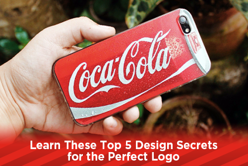
3 Keep it up to date.
Logos should be fluid. What works today in 2019 may not be relevant 100 years from now, so your logo should be able to change with the times. Many logos that were popular in the past have been reimagined to fit the culture of the times. Some logos, such as Coca-Cola and Ford Motor Company, have withstood the test of time and kept their look for years. While others have morphed into something totally different than when they began. Check out Amazon's transition from when they began to today.
4 Make an Impact.
What does it take to make a logo memorable? Sometimes, it's not the design of the logo. Look at the Nike swoosh. Seeing a checkmark on a shirt or sneaker doesn't say anything about the company that it represents. Without the marketing, spokespeople, and quality of service Nike's brand has created, the checkmark is dull and boring. It's only with the association of the brand does the swoosh mark symbolize anything. Your company has to do everything else right for the logo to become memorable. Remember, the logo you create is just symbolic of your brand.
5 Look great everywhere.
Not only does the logo need to be scalable, but also look great everywhere and anywhere it is used. If you create a great looking logo in many colors, and it does not look good in black and white, that logo is useless. Many of today's new logos are created to look good on the screen of a computer or phone. When you try and translate that look into a one or two color design for print, the logo can lose its impact.
There are many different factors that go into creating a great logo, and many of those have little to do with the design of the logo. People want to be the next great Paul Rand, or Milton Glaser and make great looking logos. But a great looking logo with a horrible company will not garner you celebrity status. Instead, focus on creating a logo that speaks to the general public. Work hard to get your "look" down and knock out some good-looking designs for companies that understand their brand. Great logos, just like great designers, are not created overnight.
JOIN US!
Click here to subscribe to our mailing list if you would you like receive more helpful print related articles in your inbox every week.