
Part 1 of our 3 part designing for print post, Designing for Print Part 1: What to Consider, taught you to think about the end product before you begin designing it. Keeping in mind things like panel sizes and folds while using the proper applications to create the different pieces of your design. Today, we will look at how colors need to be approached, and the proper way to create or edit your images in Photoshop.
Work in CMYK not RGB
The biggest difference in designing for print instead of online, is working in CMYK and not RGB. CMYK stands for Cyan, Magenta, Yellow and Black which are the process colors of printing. RGB, or Red, Green, Blue, are the colors used by monitors and tv's for producing colors. The range of colors you can achieve using RGB or CMYK is called the colors gamut. RGB has a larger gamut than CMYK does, so some colors can not be achieved in CMYK. If you start out your designs in RGB, then send it to the printers to be printed in CMYK, your design will look darker and muddier and not how you want it to. Instead, design only in CMYK in order to see how each part of your design will look.
Convert Any Pantone Colors to Process
If your print media project uses any Pantone colors that will be printed in process, be sure to convert those Pantone colors to process in your color palette. Like RGB colors, when you use a Pantone color and leave it as a spot color in your design application, the color will look different than the final printed piece. Pantone colors are created by Pantone Inc. in order to set a standard for certain colors. When you choose a Pantone color for a logo, then the logo should have the same look wherever it is printed, based on that Pantone color.
Converting the Pantone color to process while you are designing the piece, allows you to see a better representation of how the color will print in process for your design. Many Pantone colors look different in process than they do as a spot color. Again, this is because of the color gamut range of CMYK. Using a Pantone color book that shows the CMYK equivalent, or looking on Pantone's website for the color conversion, will allow you to see how the Pantone color will appear when printed in CMYK. If your project is printing as process, the Pantone color will eventually be converted to CMYK at the printing company.
Do not have Duplicate Pantone Colors
Your project may not print in process at all, but only print as Pantone or PMS (Pantone Matching System) colors. In this case, be sure to only have one Pantone color name in your file and not duplicates. You can select coated or uncoated PMS colors in your color palette; mixing the two will cause the output of two plates of the same color. While you are designing the file, check your color palette to be sure you are using only one named PMS color. Many times an eps file will use a color like Pantone 280U, and get placed into an InDesign file using Pantone 280C. Now there are two spot colors in your palette producing two plates when output at the service provider. Fixing this in the design stage will save production time.
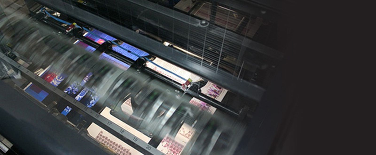
Use Only High Resolution Images
When designing for digital, using image files that are only 72ppi (ppi= pixels per inch) can save you time when working in image applications like Photoshop. With projects that will be offset printed, your images need to be 300ppi at 100%. High resolution images will have more clarity and print better than images at 150 or 72ppi. You can use a 72ppi image if it is placed at a greatly reduced size. The resolution of an image will change as it is reduced or enlarged; for example, a 72ppi image placed at 50% will double its resolution to 144ppi, and placed at 25%, the image will be 288ppi and be usable for offset printing.
If you have to create any image in Photoshop that will be offset printed, take note of the size the image needs to be in InDesign. Create the Photoshop image at 100% of that size (or add width or height if the image will bleed off of the page) at 300ppi and CMYK. Once the image is created and placed at 100% its size, there will be no loss of clarity when it is printed. If your image is 72ppi but you need to adjust it in Photoshop, and you know you will place it at 25% or less, go ahead and change its ppi in Photoshop to 300, but allow Photoshop to resize the image as you adjust the ppi. This will take an image that is 22" wide at 72ppi and reduce it to an image that is 5" wide at 300ppi.
Placing a 72ppi image at anything over 25% will result in an image that looks pixelated and low resolution. Similarly, placing a 300ppi image more than 120% will also give you a pixelated and low resolution image.
Paper Choices and Image Saturation
Printing on gloss coated papers will give your images and colors a nice vibrant look as they sit on top of the coating of the paper. Printing on uncoated papers will desaturate your images and colors, as the ink soaks into the paper. Because of this, when you know your print project is going on an uncoated paper, go ahead and adjust your images before they are printed. If your images are super dark, adjusting the shadows and midtones will help the images be clearer once printed.
Although service providers will apply a curve to your art when producing plates for uncoated papers to help adjust for saturation, it will still be helpful to adjust your images in the shadows and midtones. Adjusting images in the design stage will help your job to go smoothly through the production stage. Be sure to keep originals of your images in case you desaturate them too much. Requesting a hard copy proof of your project will allow you to see a good representation of how the images will look once printed.
Our next post, Designing for Print: Sending Files to the Printer, will look at what files need to be sent to the printing company, and what needs to be done to prepare those files to be sent.
Would you like more helpful print related articles sent to your inbox? Click here to subscribe to our mailing list and receive our bi-weekly article posts every Tuesday and Thursday.