

The largest difference between print and digital media, is working in CMYK vs RGB. In this article, we will look at the differences of CMYK and RGB.
Definition
CMYK are the four inks used by offset printers and stands for Cyan, Magenta, Yellow and Black (the K comes from the term key plate, meaning black is the key to achieving a rich photo like print). RGB stands for Red, Green and Blue which are the colors that make up the electric diodes in television and monitors.
CMYK is a subtractive color model, meaning you add more ink colors to achieve black. Different ink colors absorb and reflect light in different wavelengths.
RGB is a additive color model, meaning the more RGB light beams added, the closer to white you will get. If no light is emitted, you will see black.
Color Gamut
A gamut is the complete range or scope of something. In digital and print design, a color gamut is the range of colors you can achieve using different color combinations like CMYK and RGB. An RGB color gamut is much larger than a CMYK color gamut, meaning you can achieve many more colors in RGB than you can in CMYK. This is why your design may look awesome on screen, but when printed it becomes muddied and dark. Some colors can not be reproduced using CMYK so when you convert the image from RGB to CMYK, some colors will lose their vibrance.
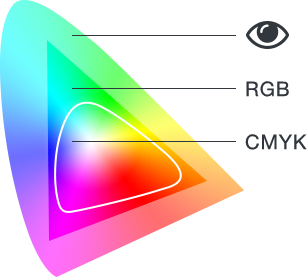
This graphic shows the visible spectrum we can see, the colors you can achieve using RGB, and colors achievable in CMYK.
With today’s wide format printers that have 12 ink colors, you can achieve a closer look to RGB images, but some of the brighter colors will still be off. In order to achieve the look you are striving for, it is best to do any work that will be printed in the CMYK color mode.
RGB Black vs CMYK Black
Many times we receive files that have black text in RGB. Unfortunately, when RGB black is converted to CMYK black, the outcome is a dull dark grey instead of solid rich black. This is because the RGB black (0,0,0 values), when converted, turns into a black build of 75C, 68M, 67Y and 90K. Any text that you have black needs to be 100% black and not built in RGB or CMYK. Large areas of black look best if you create a “rich black” color of 20% cyan, magenta, yellow and 100% black.
Your Best Option
New printing processes and inks are always being created and updated to reach a more natural look in offset printing. There are so many factors at play that man will never be able to reach the colors our eyes can perceive in nature and reproduce them on paper. Even the high resolution 4k and 5k monitors can not replicate all colors found in nature.
If you are using a Pantone spot color in your design, go ahead and convert it to CMYK if you are printing in process colors. Ripping software used by commercial printers, could alter the color depending on how the spot color is converted to CMYK. For best results, reference Pantone’s online color finder to see what CMYK values are needed for the color you are using.
Working in CMYK mode in Photoshop will give you the best printed outcome for your images, and all graphics should be created in CMYK when designed for print. If you are looking to have your images look more vibrant, consider printing on a coated sheet that allows the ink to sit on top of the paper and not sink in. Also, trained and talented press operators can adjust the colors when printing to add more “pop” to your images.
Stay up to date by subscribing to our mailing list.