
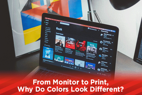
This month, our blog articles are going to look at colors. We aim to help designers to make a good transition from computer screen to ink on paper with their designs. In today's article, we will look at how colors differ and sometimes change from how they look on your screen to when they are printed on paper.
Transition From RGB to CMYK
In order to design effectively for offset printing, you first have to understand that your monitor does not display CMYK colors, instead it displays images by using RGB light. RGB stands for Red, Green, and Blue, and mixing these colors will give you a wide range of colors, called a gamut. RGB is an additive color model, meaning that when you add different values of red, green and blue light, you can achieve other colors. If you have no RGB colors, then you have black; if you have 100% of each RGB, then you get white. In the natural world, our eyes can perceive a wide arrange of colors. To reproduce most of these colors, monitors use RGB light which is limited to the amount of colors that can be reproduced.
Any file that needs to be offset printed, has to be converted to CMYK (cyan, magenta, yellow and black) in order to have better control over your colors. CMYK is a subtractive color model, meaning that you are dealing with the whiteness of the paper and adding inks to create colors. If you have no inks, you are showing the medium being printed on (white is the standard color); if all of your inks are present, you get black. The color range achievable using CMYK inks is lower than the range achieved by RGB. This is why colors will look brighter and richer on your monitor, and muddy on paper. Working in CMYK mode in Photoshop will help you control your colors better. You can also work with color profiles in Photoshop that helps keep your colors within the allotted gamut of the chosen profile.
Paper Coatings and Varnishes
There are a number of factors that can affect how your colors reproduce when offset printing, including the coating, whiteness and brightness of the paper you are using. Some papers come with a coating that protects the sheet from scratches and fading, but this coating will also affect the color of your inks. With a coated paper, the inks will sit on top of the coating and be brighter, where an uncoated sheet allows the ink to saturate into the paper making the inks darker. Coatings can also have a tint of color to them, which can also affect your colors.
Paper Whiteness
Understanding the whiteness and brightness of your paper will help you achieve optimal color results. Though the two terms are similar, they are not interchangeable. The whiteness of paper is the reflection of all of the wavelengths of the color spectrum. In order for paper manufacturers to produce papers with different whitenessess a standard had to be set. The International Commission on Illumination (CIE) chose to call the standard CIE Standard Illuminant D65, which according to Wikipedia, is roughly the average midday light in Western Europe / Northern Europe.
Paper Brightness
The brightness of paper is determined by how much a specific wavelength of blue light is reflected by the surface. The higher the brightness number, the more blue light is reflected giving the paper a brighter look. Offset printing is achieved by breaking the process colors down into dots, called halftones, and arranging them in a pattern, called a rosette. Depending on the amount of halftones, the paper surface can show through the rosette pattern. If you oversaturate a bright paper with ink by having dark halftones that do not allow the paper to show through, then your colors could look darker.
Paper Varnishes
Once your job has been printed, a varnish or coating can be applied to the paper. This coating can help protect the ink from scratching and smearing as it dries faster than the ink, but it can also affect your colors. Most of the time the color change is negligible, unless the varnish or coating has a tint to it.
Printing Curves
As I stated earlier, printing on a coated paper allows the ink to sit on top of the coating giving you a brighter look to your colors, and printing on an uncoated sheet allows the inks to soak into the paper, darkening the print. To compensate for that saturation, printing companies use different curves when they create the plates for the press. These curves are calibrated to reduce the percentage of halftone depending on how much the ink soaks into the paper. If you look at the halftone dot of a plate that prints on coated paper, a 100% dot would be 100%, 50% dot at 50% screen, and so forth. On a plate for an uncoated sheet, the halftones will be different. Areas that have 100% ink might only have a 95% dot, 50% ink maybe a 40% dot, etc. This is because once the ink is printed on the uncoated sheet and soaks into it, a 40% dot will be visibly as dark as a 50% dot. Using different curves for different coated papers will affect your colors. As a designer, you do not have to worry about this too much, your printing company should have everything dialed in and dot gain adjusted for with their curves.
Pantone Colors
Pantone, or PMS colors, were created by the Pantone company to establish a universal color language. The colors are pre mixed and issued a PMS number code, making it easy for printing companies around the world to match colors with a CMYK build or mixed ink. Many of the colors can be printed using a mixture of CMYK inks, but there are a few whose colors can not be recreated in CMYK. The build may be close like PMS 341, or it may be way off like PMS 1767c, and others like the metallics or neons that will not match at all. If you designate a spot PMS color in your file, depending on the printing company's settings in their prepress department, your color may look different. Even some Adobe applications will convert a PMS color to different CMYK builds. To better control the color, use the color finder tool on the Pantone website and convert the PMS color to CMYK before sending to the printer.
With all of these variables in place, how can you design for optimal color reproduction from your screen to printed paper? If you are a new designer, or using a new printing company, take the time to visit their shop. Ask questions about color, paper, coatings and everything else you can think of. Get their suggestions, or tools to use before you even begin a print project. Doing this will keep you from doing twice the amount of work and establish your relationship with the print company.
Design Tips
- Always work in CMYK on any print jobs. In Photoshop and Illustrator be sure to work in CMYK mode. There are a few filters in Photoshop that only work in RGB mode. If you use those, be sure to convert back to CMYK before saving your file.
- Use the online Pantone color finder tool to convert spot PMS colors to Pantone's suggested CMYK build. If you leave the color as a spot color, applications may convert it differently than you are looking for.
- Always output a CMYK high resolution (300lpi) PDF file with crop marks and bleeds. Even if you place CMYK files into your InDesign document and export as RGB, the colors will change.
- Watch out for oversaturated colors. When you layer colors on top of colors, the image can be oversaturated with ink. Printing companies prefer an ink limit no more than 250%. To see the total ink in Photoshop, open the Info window and clicking the menu, select Panel Options. Choose either the First or Second Color Readout to show Ink Limit. Now when your mouse is over your image, the info box will show the total amount of ink saturation.
A quicker way to see total ink within your files is to save as a PDF file. Open in Acrobat, choose tools, Print Production, Output Preview. At the bottom of the window, click the Total Area Coverage check box and enter 250% in the window. Now, everywhere that has ink saturation over 250% will be highlighted.
Hopefully this article will help the colors of your designs look closer to what you see on your screen. If you have things in place that your printing company suggests to help you with colors, then you will save many hours of rework. As always, if you have any questions or need help with anything, please do not hesitate to contact us here at PrintSouth Printing.
Would you like more helpful print related articles sent to your inbox? Click here to subscribe to our mailing list and receive our bi-weekly article posts every Tuesday and Thursday.